The UAE is one of the most multilingual markets in the world. On a single road in Dubai, the drivers around a branded van might read Arabic, English, Hindi, Urdu, Malayalam, Tagalog or Russian. For many businesses, especially those serving local Emirati customers, government clients or families across the emirates, putting both Arabic and English on their vehicles is a natural choice.
But bilingual graphics are harder to design than they look. Two scripts, two reading directions and twice the text on the same panel can quickly turn a clean design into clutter. This guide explains how to plan bilingual vehicle graphics in Dubai that stay readable and look intentional.
Why Use Bilingual Vehicle Graphics?
- Reach: Arabic speaks directly to Emirati and Arab customers; English reaches the wider expatriate population.
- Trust: a well-set Arabic name signals a local, established business.
- Consistency: many companies already use bilingual trade names on their licence, shopfront and stationery.
- Government and corporate work: bilingual branding fits the expectations of many public sector and semi-government clients.
The Core Challenge: Two Directions, One Panel
Arabic reads right to left; English reads left to right. On a moving vehicle, the eye has only a few seconds to find the information. If the two languages compete for attention, neither is read properly.
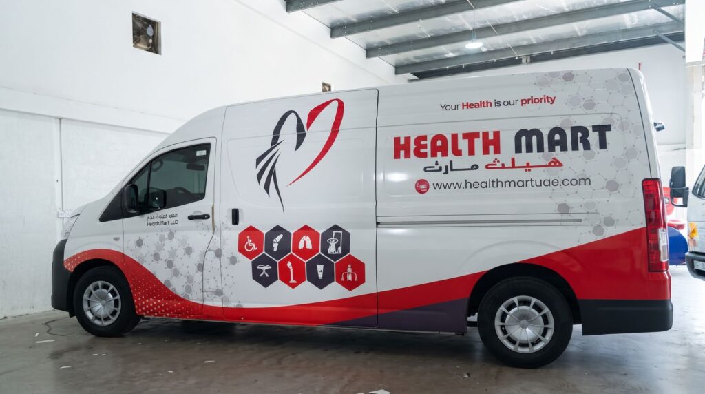
The solution is to decide on hierarchy before design begins: which language leads, which supports, and where each sits.
Layout Options That Work
Stacked
Arabic above English, or English above Arabic, centred or aligned to a common edge. This is the most common and usually the clearest layout for logos and company names.
Side by side
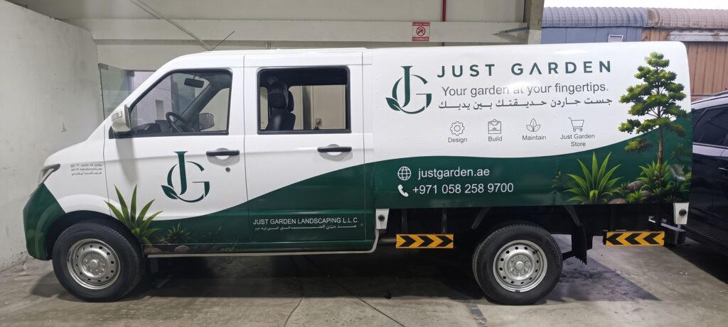
Arabic on the right, English on the left, mirroring their reading directions, with the logo between them. This works well on long panels such as van and truck sides.
Split by panel
One language per side of the vehicle, or one language on the sides and both on the rear. This keeps each panel clean, though it means some viewers will only see one language.
Logo plus one line
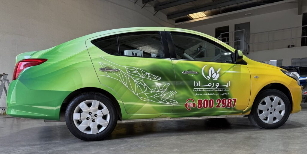
Bilingual logo, with supporting text in one language only. Often the simplest way to keep a car or small van uncluttered.
Typography Tips
- Pair the scripts intentionally. Choose an Arabic typeface designed to sit with your English one, matching weight and character rather than just size.
- Match visual size, not point size. Arabic and Latin letters at the same point size can look very different. Adjust until they appear balanced.
- Avoid decorative calligraphy for small text. Ornate scripts look beautiful at logo size but become unreadable at road distance.
- Keep Arabic letters connected. Arabic text must be set with proper shaping so letters join correctly. Text pasted into design software that does not support Arabic can break into separate letters, which looks unprofessional and is hard to read.
- Have a native speaker proofread. Spelling errors and broken letterforms in Arabic are noticed immediately by Arabic readers.
Our article on using typography effectively in vehicle branding covers type choice in more detail.
What to Put in Each Language
Bilingual does not mean everything twice. A practical approach:
| Element | Arabic | English |
|---|---|---|
| Company name and logo | Yes | Yes |
| Short service description | Optional | Yes |
| Phone number | Shared numerals | Shared numerals |
| Website and QR code | Shared | Shared |
| Taglines | One language, or both if short | One language, or both if short |
Numbers, websites and QR codes do not need repeating, which saves space.
Keep It Uncluttered
Bilingual text takes more room, so the rest of the design must be simpler. Remove secondary services, social media icons and long taglines. Our guide to information overload in vehicle branding explains why less is more on a moving vehicle.
Check the Content Before Submission
RTA reviews the text and imagery on branded vehicles, in every language. Make sure Arabic translations are accurate and that the content in both languages matches your trade licence and approved activities. See why RTA rejects vehicle branding for common issues.
Test with a Mockup
Always review a full-size mockup of each side of the vehicle before printing. Check that both languages are readable from a distance, that Arabic text is correctly joined and that neither language falls across door gaps or handles. Our article on RTA-ready vehicle branding mockups shows what to look for.
Common Bilingual Design Mistakes
These are the issues we see most often on bilingual vehicle graphics in the UAE:
- Machine translation. Automatic translation tools often produce awkward or incorrect Arabic. Use a professional translator for any text beyond the company name.
- Unbalanced sizes. One language looks much larger or heavier than the other, which makes the design feel unplanned.
- Mismatched styles. A modern geometric English font next to a traditional Arabic calligraphic style can clash. Choose fonts with a similar personality.
- Reversed or broken Arabic. Text that runs left to right or appears as disconnected letters is a clear sign of software that does not support Arabic.
- Everything translated. Repeating every line in both languages doubles the text and halves readability.
- Inconsistent names. The Arabic company name on the vehicle should match the Arabic name on your trade licence and other branding.
Catching these at the mockup stage is quick and inexpensive. Catching them after printing means reprinting panels and, if the permit has already been issued, possibly resubmitting the design.
Design Bilingual Graphics with Printzone
Since 2010, Printzone has designed and installed Arabic and English vehicle graphics for businesses across Dubai and the UAE. Our team sets both scripts correctly, balances the layout for each vehicle and handles RTA approval. Explore our vehicle graphics and car sticker printing services, or contact Printzone to start your design.
Feel free to leave a comment!
Your email address will not be published. Required fields are marked *