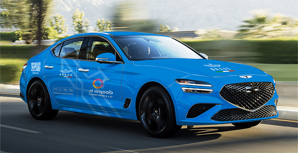
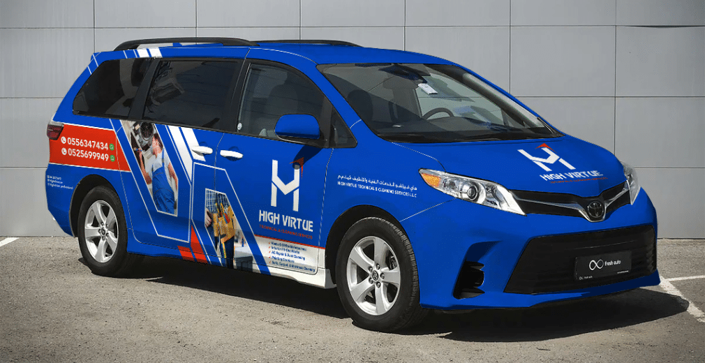
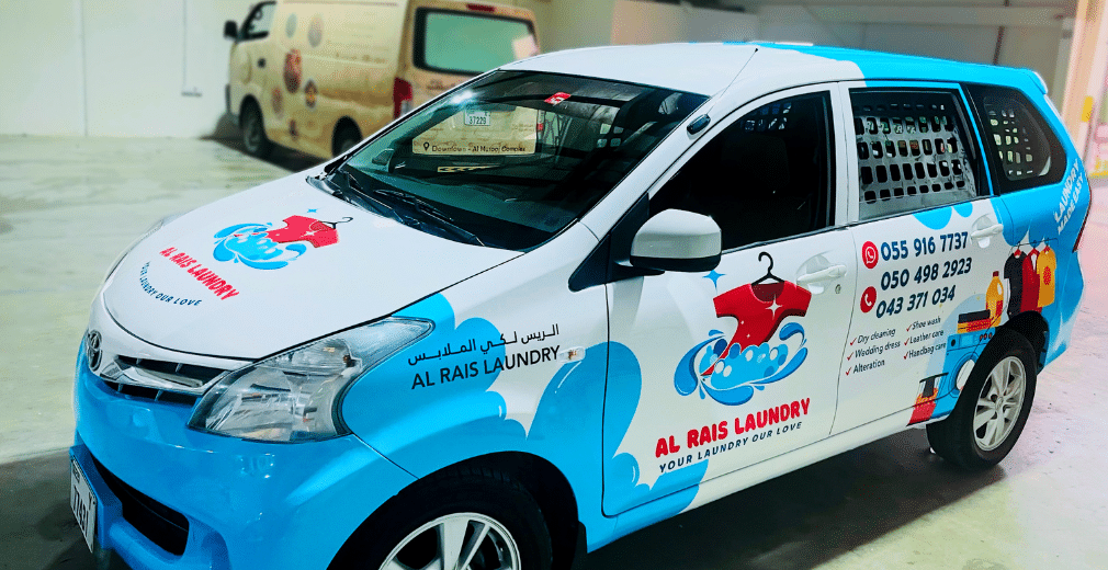
Vinyl car wraps are a good way for brands to reach a wider audience. That being said, there are a few mistakes that people make. This is why it’s critical to approach only reputable vehicle branding companies in Dubai.

Here are some common mistakes spotted by our experts and how you can rectify them.
1. Choosing the Material
The vinyl’s quality must be carefully considered. Owners are frequently tempted to choose a lower-quality vinyl to save a little money, but doing so can lead to early damage to the vinyl graphics. This could result in peeling, discoloration, or bubble formation, making your car unattractive. While cutting this expense may initially seem more cost-effective, choosing low-quality materials may cost you more in the long run.
2. Not Keeping Your Vehicle Prepared
Prior to having your car wrapped, make sure it is clean. Oil, dust, grease, or dirt reduce the adhesiveness of the material and can result in bubbles or wrinkling. It might also damage the car’s paint.
3. Getting it Done By Yourself
Getting your car wrapped in vinyl graphics requires extensive knowledge and experience, and this can only be done with a professional car vinyl wrap Dubai company. If not, it can result in stretched vinyl, warped portions, bubble formation, and patchy areas, ruining the paint and discoloration.
4. Not Choosing the Font
The primary goal of vehicle graphics is to draw customers in by way of branding or to provide information about promotions to anyone who sees them. Your content should therefore be readable. If readers comprehend the content, they can identify or contact your company. Be cautious because your potential clients may view the details up close or while driving. So, when branding your vehicle, try to stay away from fancy texts and fonts.
5. Avoiding Bright Colors
Use color and design to draw attention without fear. People’s attention can be captured with vibrant colors and entertaining artwork. Additionally, remember that most people will only see your car while it is moving or when they are passing by, so the message must be clear and readable.
6. Not Keeping it Simple Yet Classy
One of the biggest mistakes companies make is producing busy designs that are often difficult to read. So, make sure all the text is easy to read and blends well with the design and colors.
You also need to take into account the dimensions of the vehicle, from design to functionality. Less is usually more when it comes to vinyl vehicle graphics. So, be aware of all the information you want to include.
7. Not Using the Right Tools
Using the wrong tools for the installation of your car wrap can damage the material and make the process much harder. Professional installers rely on specialized tools like squeegees, heat guns, and sharp knives to achieve a flawless finish.
If you attempt a DIY project, be sure you’re using the right equipment, or consider hiring a professional car wrapping company in Dubai to ensure the job is done correctly.
8. Overstretching the Vinyl
Vinyl is a flexible material, but it must be stretched carefully. Overstretching can thin out the vinyl, causing it to tear, fade, or wear down prematurely. Professionals know how to use the correct amount of heat and tension to ensure that the vinyl conforms to your car’s curves without being overstretched. When applied properly, the vinyl wrap will adhere securely, remaining durable over time.
9. Ignoring Local Regulations
In Dubai, vehicle modifications are subject to specific rules and regulations. It is essential to ensure that your car wrap complies with local laws. Failing to adhere to these regulations can result in fines or penalties.
Working with an experienced car wrapping company in Dubai will ensure your vehicle wrap is fully compliant with any restrictions or guidelines, avoiding any potential legal issues down the road.
10. Rushing the Process
Wrapping a vehicle is a detailed process that requires patience and careful attention to detail. Rushing through the job can lead to unsightly wrinkles, air bubbles, and an overall subpar finish. Whether you are having it professionally done or attempting it yourself, take the time necessary to achieve the best results. Quality installation takes time, and the end product will be worth it.
Tips for Precise Vinyl Wrap Application

1. Thoroughly Clean the Surface
Before applying the vinyl wrap, the vehicle’s surface must be spotless. Any dirt, dust, or grease can interfere with the adhesive, causing the wrap to lift or bubble over time. Use a microfiber cloth and a non-abrasive cleaner to remove any debris or residue from the vehicle.
2. Use the Right Tools
Proper tools are essential for a successful vinyl wrap application. Ensure you have the right tools, such as a heat gun, squeegee, utility knife, and measuring tape. A heat gun helps to soften the vinyl and make it more pliable for application.
A squeegee is used to remove air bubbles and smooth the vinyl onto the surface, while a sharp utility knife is crucial for trimming excess material around edges and contours.
[Subscribe us on YouTube: PRINTZONE ADVERTISING LLC]
3. Apply in a Controlled Environment
Vinyl wrapping should ideally be done in a controlled environment, such as a temperature-regulated workshop or garage. Extreme temperatures (either too hot or too cold) can affect the vinyl’s adhesive properties and flexibility.
4. Stretch the Vinyl Carefully
While vinyl can stretch to conform to the shape of your vehicle, overstretching can cause it to thin out or tear. When applying the vinyl, use gentle tension and avoid pulling it too tightly. Instead, heat the vinyl with a heat gun before applying it, which will make it more flexible and easier to mold to your vehicle’s curves and edges.
5. Work in Small Sections
To ensure an even and smooth application, it is best to work in small sections at a time. Start at one corner or edge, and gradually apply the vinyl, smoothing it out as you go. This method helps avoid wrinkles, bubbles, or misalignment, and gives you better control over the application.
It is also easier to fix any issues when working in smaller, manageable sections rather than trying to apply the entire wrap at once.
6. Use a Squeegee to Eliminate Air Bubbles
Air bubbles are one of the most common issues during vinyl wrap installation. To prevent them, use a squeegee to press the vinyl onto the surface of the vehicle, pushing out any trapped air.
If you do find a bubble, use a pin or needle to carefully puncture it, then press the air out with the squeegee. Working slowly and methodically can minimize the chance of bubbles forming.
7. Allow Time for Proper Curing
Once the vinyl is applied, it is important to let it cure properly. This ensures that the adhesive has fully bonded to the vehicle’s surface and that the wrap stays in place. Although vinyl wraps can be used immediately after application, it’s recommended to avoid washing the car or exposing it to extreme weather conditions (like heavy rain or snow) for at least 24-48 hours to allow the wrap to set.

Work with a professional car vinyl wrap company in Dubai and make sure they follow these tips for precise vinyl wrap application. You can make sure that your wrap maintains the appearance of your car and strengthens your branding efforts while also looking professional and lasting a long time.
